Hospitality eCommerce Platform
OneJourney; Journey HospitalityProject Brief
OneJourney is a new eCommerce platform designed to increase online revenue by simplifying the guest booking experience to one basket, one checkout, and just one purchase.
Integrating with hoteliers existing operations solutions, OneJourney is a SaaS product providing a simple, customised UI for hoteliers to extend their offering to all users to book rooms, tables, spa days, experiences, products and gift vouchers directly within one platform.
My Role
As the only UX designer on this project, I performed roles including:
- MVP definition
- Wireframes
- UI design and Prototyping
- Usability Testing
- Design system design
- User Acceptance Testing
The Process
The process was project specific and determined by many factors such as the project goals, business needs, complexity of the problem and time.
I joined the project midway through the development stage, succeeding another designer. As a consequence, there was limited time to carry out foundational research as the business were keen to get the product to market.
I therefore opted to used a blended Lean UX and agile process to focus on the user while integrating with the existing Agile team's process. This approach allowed for a design process that would not delay the development while providing valuable user insight and iterative feedback.
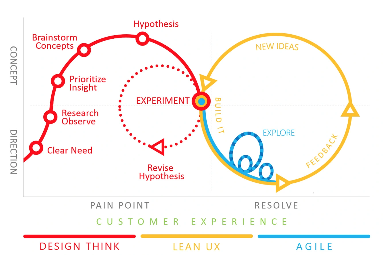
Design Thinking
Direction
The first part of the process was to understand the needs and limitations of the project.
- The product needed to integrate with multiple existing operational systems, enabling users to have a unified booking experience with one simple transaction.
- The product UI needed to overcome limitations in the integrated systems API such as limited data, slow speeds and complex validation requirements to provide an optimised UX.
- The product needed to be customisable allowing hotels to set their colours, fonts and branding while providing a UI that meetings WCAG AA standards.
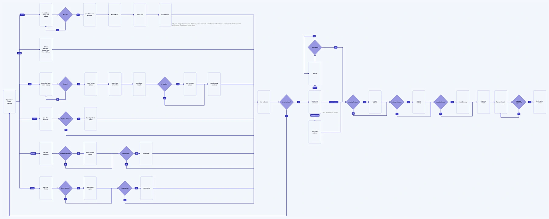
User Flow Mapping
Before going into the concept stages of the process I made sure to polish the user interactions flow.
The following feature flow chart describes the user flow throughout the product including key interactions required by the integrations. The multifaceted nature of the product and integrations meant creating a consistent user flow was key to providing a predictable and frictionless user experience.
Concepts
To brainstorm and test the initial design I created wireframes and tested using Adobe XD.
I wireframed each iteration and added the elements and screens that were necessary to reach users' goals, to quickly see which ideas worked best. I put the sketches into XD to build an interactive prototype and tested user stories with different individuals.
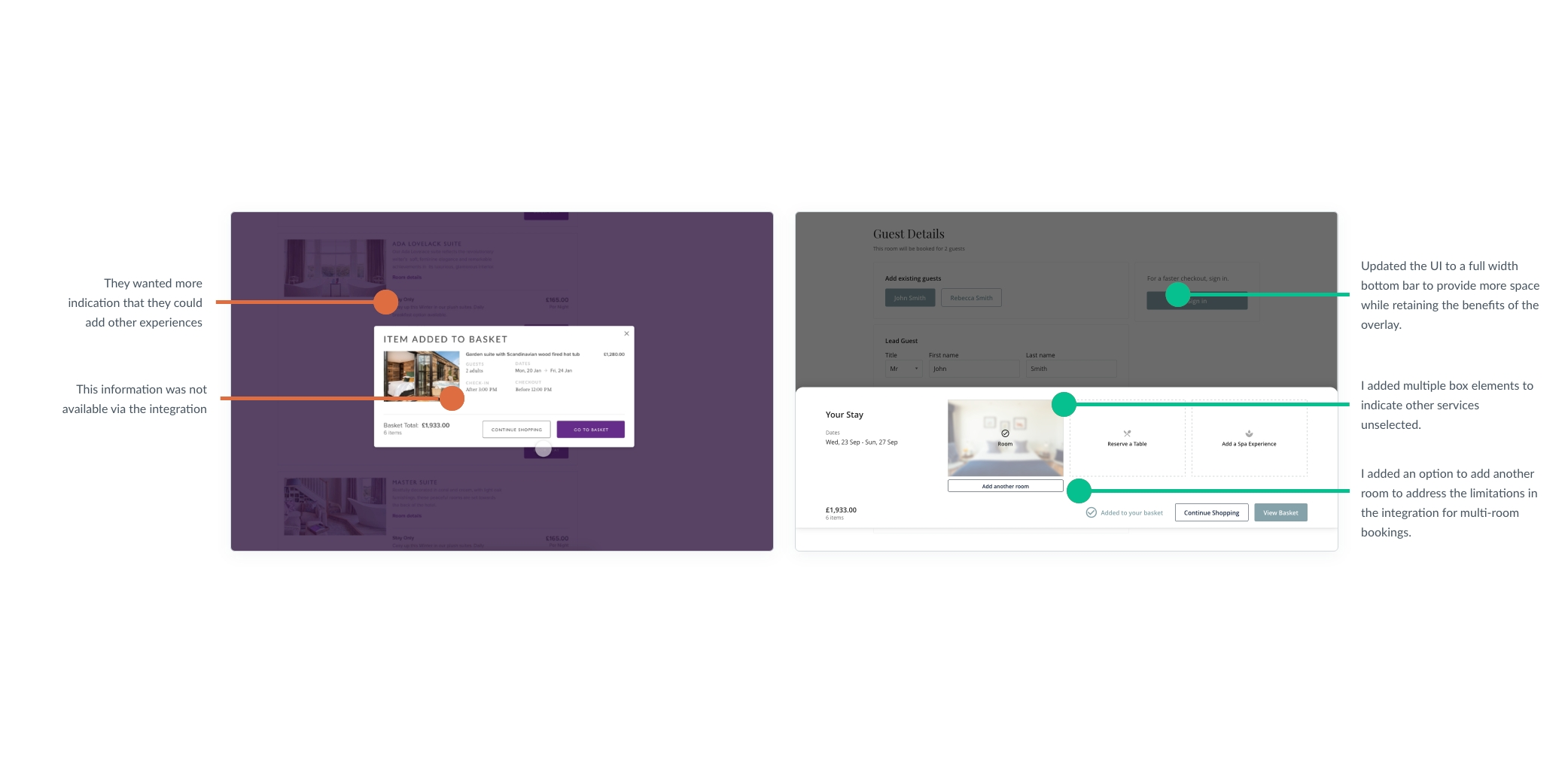
Findings and Design Solutions
- Users found the search text, “Search Experiences”, confusing and were unclear about the action.
- Users wanted more indication that they could add other experiences to their basket after adding an item.
- The development team identified that listed information about the room was not available via the API and would have to be limited to paragraph content.
Design Solutions
- The button was simplified to “Search” with a clearer focus on the to and from dates, implementing Jakob’s Law and keeping the search more aligned to other sites they already know.
- The 'added to basket' screen was updated to include primary options, dining and spa.
- The list content was removed from the room page with a request for this feature logged.
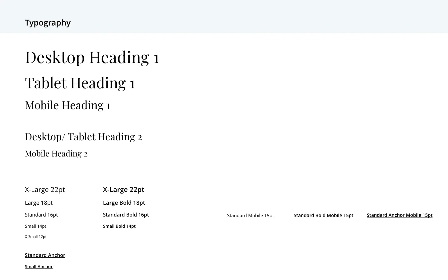
Design System
A design system was created using XD to help manage the layout, spacing, breakpoints, colours, typography and components.
This design system was then shared using ZeroHeight for the development team to refer to alongside the XD shared designs.
Feedback
Using the agile approach to the development meant rapid iteration. The features were broken down into recognisable epics; rooms, dining, spa, products, events and gift vouchers.
This approach allowed for features to be designed and tested in sprints ahead of the development of each epic.
Finding
- Users wanted to see the rates and prices for the rooms on the room page instead of clicking to book so that they could view the rate price alongside the room details.
- Users wanted to be able to select existing guests when adding additional items to their basket.
- Hoteliers wanted to allow guests to add additional notes/ requests to their rooms, dining and spa bookings.
Design Solutions
- The rooms page was redesigned to include rates within the page content, adding anchor links to mobile devices.
- An option was added to allow existing guests to be added.
- An input field was integrated and implemented to allow for notes.
Project Learnings
- Process is essential: For a project that is vast, it gives you a roadmap to navigate through.
- Research is powerful: The lack of up-front research as a result of not being with the project from the start meant that much of the learnings needed to be made later in the process.
- Users and Business Goals: To create the space where user needs meet business goals I had to thoroughly understand the business perspective and interpret these to make OneJourney conversion-centred.